Color Psychology: How to Best Use 6 Colors in Learning
This post may contain affiliate links.
Marketing departments spend millions of dollars on color psychology. Why? Because people see color before anything else. But if you’re a teacher, you probably want to know the best way to use color in learning and instruction. I assure you, as a teacher who used color psychology every day, it’s one of the most important tools that teachers can use in the classroom.
Color triggers physical, emotional, and cognitive effects. In consumers. And in students.
So if color affects learning (which it does), keep reading for how to use color to benefit your students memory, performance, and concentration.
Color Psychology: How to Use Color in Learning
Kids will pay better attention and remember information better when color is utilized to present information.
Use color to learn and recall information. Studies of people with Alzheimer’s Disease showed improved memory with color cues. Other color theory studies show that learners recall images better if they are in color, not in black and white.
How does this apply to the classroom?
For example: when creating thinking maps (also called graphic organizers) differentiate and organize topics and sub-topics by color and hue. Then when learners need to remember, they’ll be able to recall the color cues as well as the information.
Let’s look at how colors affect students. It’s essential to consider the psychological effects according to color psychology to you know what colors to use for retention, recall, and attention.

The Color RED
Why do you think stop signs are red? Red screams pay attention to me!! The color RED helps learners remember information, facts, and figures. Red on white is the easiest to read. But a little goes a long way with this color choice so use red sparingly.
Want to get your kids excited to learn? Use RED ink or print on RED paper.
Want to get your kids to remember what they learn? Use RED ink or print on RED paper.
STOP AND READ THIS: Do NOT mark mistakes in red. Using red like this would reinforce the student’s mistake. Don’t do it!
Write key points in red.
Write homework lists in red.
Write things you want the student to learn and remember.

The Color GREEN
The color green is not only a relaxing color, but it’s associated with all things healthy, and it helps concentration.
Want kids to concentrate on what you’re teaching?
Write with a green marker on a white board.
Use a green light bulb in a desk lamp.
Decorate with leafy green plants.

The Color BLUE
According to color psychology, the color blue promotes creativity and peaceful feelings. Educators can use blue for learning situations that are challenging.
Try using blue paper for complex information, or blue ink can improve reading comprehension.
Use blue paper for reviewing information.
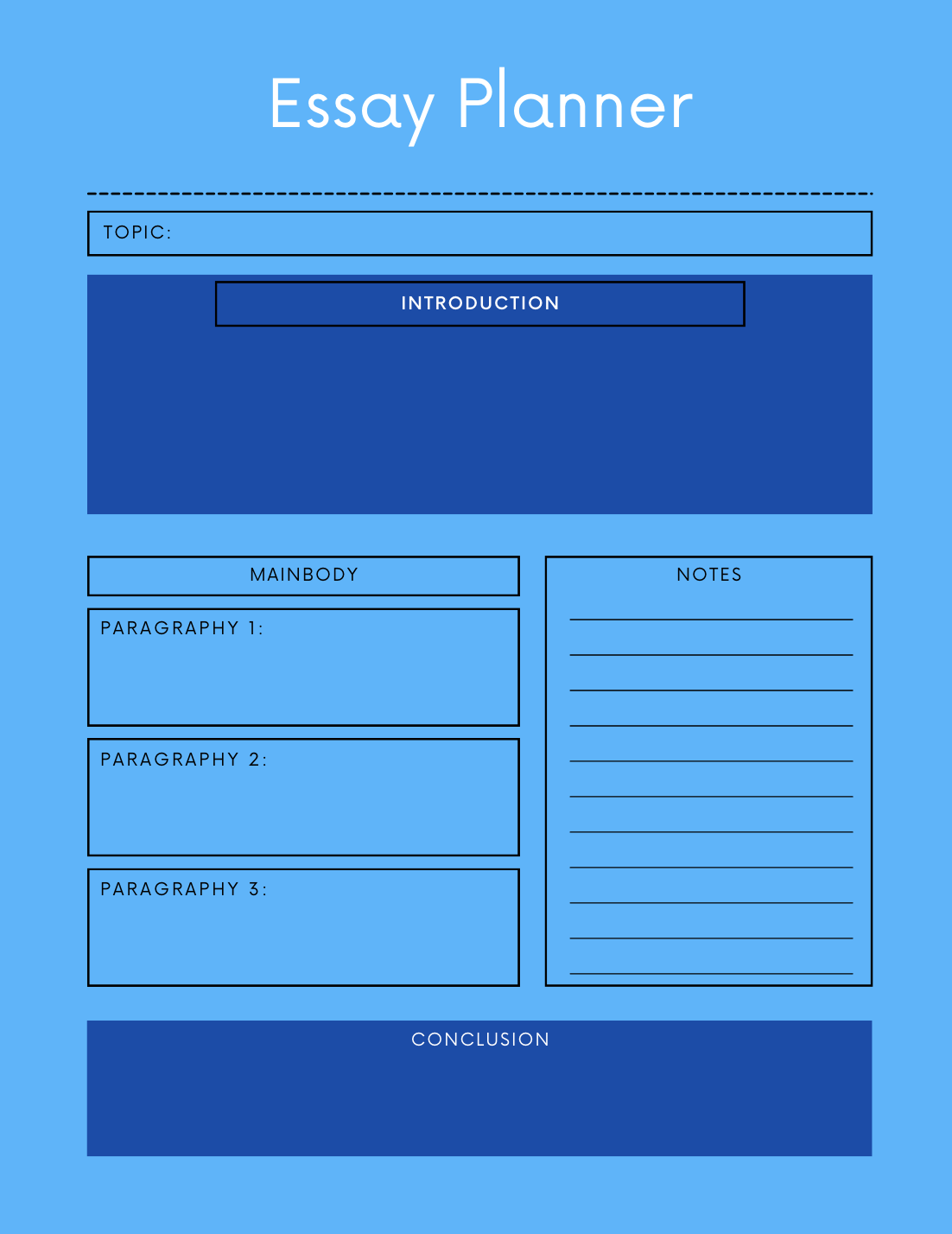
Organize your 5-paragraph essay notes and ideas into a blue-flavored flip book.
Use the colors to represent each essay section: intro, body paragraphs, and conclusion.
The Color YELLOW
The color yellow is a stimulating color that asks the learner to pay attention. That’s why so many highlighters are yellow. And school buses! 🙂 If that isn’t a clear use of color psychology in everyday life, I don’t know what is.
Highlight important information in yellow.
Use yellow colored borders on handouts.

The Color ORANGE
Welcoming and mood-lifting, the color orange can help learners feel comfortable, which improves brain function. Some research says that orange tinted glasses improve a person’s mood. Interestingly enough, orange glasses effectively block the blue light from electronics that can interfere with melatonin and sleep.

Maybe we should all wear orange tinted glasses?
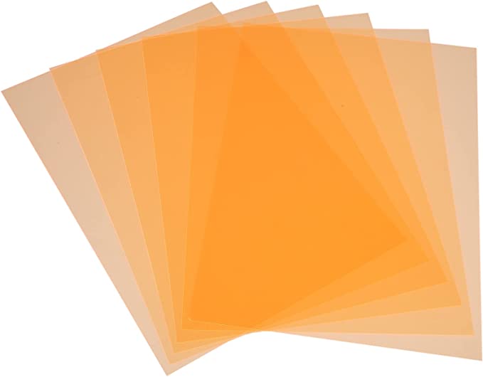 Use orange overlays on white papers for children with dyslexia, autism, and visual sensory processing disorder. Other colors can be used effectively as well. See what works best for your learner. I found an interesting book on this subject called Reading by the Colors by Helen Irlen: Overcoming Dyslexia and Other Reading Disabilities Through the Irlen Method.
Use orange paper for tests.

The Color PURPLE
Purple is the hardest color for the human eye to discriminate. Use purple ONLY with other colors only, not by itself. (But it makes me question the color psychology of marketing with the color purple. Maybe they don’t know this color choice?)

NO WHITE?!
To kids with dyslexia, autism, or visual sensory processing disorders, white paper is too bright, almost glaring. The effect of the color white is almost like sunlight to some children. Try colored overlays or tinted glasses to reduce the impact of the color.
Consider white monotone environments, all white walls. Color psychology says all white walls in a room is not an optimal learning or work environment because white is not a stimulating color.
COLOR BLINDNESS: RED AND GREEN
I’m still learning about color blindness, but it’s my understanding that color blind students have difficulties differentiating between green and red. Apparently, color blindness affects around 10% of boys and .5% of girls. Find out if any of your students are color blind before you integrate red and green into the learning process. (Here’s a link to an online color blind test for kids but the best test is done at the eye doctor’s office.)
Clearly, colors influence learners. Don’t even consider your personal preference for colors. Use colors with purpose, considering the research you’ve learned from this color psychology article. Remember, colors impact emotions, help recall, improve attention, and more. So the next time you’re asking students to take notes or do a worksheet in the classroom, carefully select the best color paper and ink for learning, attention, and recall.
Sources:
http://www.ncbi.nlm.nih.gov/pmc/articles/PMC3743993/
http://inhabitat.com/studies-prove-that-desk-plants-can-improve-worker-concentration-and-productivity/
http://www.ehow.com/info_8558418_color-affecting-memory.html
http://psycheducation.org/treatment/bipolar-disorder-light-and-darkness/
http://www.colormatters.com/the-meanings-of-colors/purple
KEEP READING


I liked it in my opinion I like working in color as well it is easier to read and better to understand. I don’t like black and white it is boring and when it is in black and white it feels like a bunch of small words and is hard to read. Color is better for you I think teachers should start giving color paper assignments I think more people will finish there work on time cause it would be understandable for them to read and take notes.